 Bianca Irofte
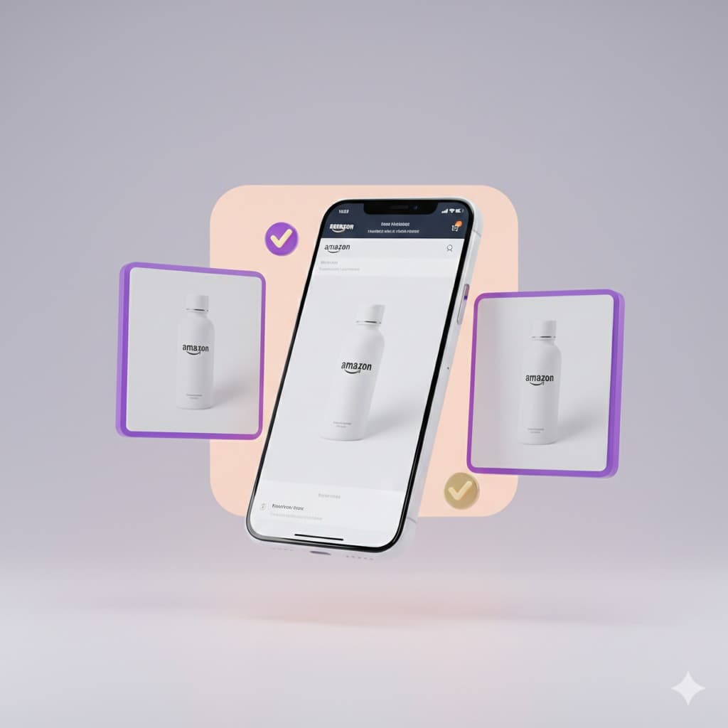
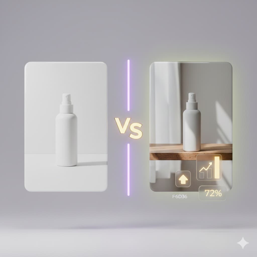
Over 70% of Amazon shoppers now browse and buy exclusively on mobile devices. Yet most sellers still design their product images for desktop screens, wondering why their conversion rates lag behind competitors.
The mobile shopping experience is fundamentally different from desktop. Small screens, touch navigation, and on-the-go browsing behavior demand a completely different approach to product imagery. When your images fail to work on mobile, you lose the majority of potential customers before they even read your product title.
Amazon mobile optimization is no longer optional. It directly impacts your click-through rates, conversion rates, and ultimately your sales volume. This guide shows you exactly how to create product images that comply with Amazon's requirements while maximizing performance on mobile devices.
Why mobile-first images matter for Amazon sellers
Amazon's algorithm considers user engagement when ranking products in search results. When mobile shoppers cannot clearly see your product, quickly understand its benefits, or feel confident about what they are buying, they bounce to the next listing. This behavior signals to Amazon that your listing is not relevant, dropping your search placement.
Mobile optimization affects every stage of the buyer journey. In search results, your main image appears as a small thumbnail competing with dozens of other products. On the product page, shoppers swipe through your image gallery looking for the information they need to purchase. If they need to pinch, zoom, or squint to understand your images, you create friction that kills sales.
Consider the practical constraints of mobile shopping. Screen sizes range from 5 to 7 inches. Connection speeds vary, affecting image load times. Shoppers often browse while distracted, multitasking, or in poor lighting conditions. Your images must work flawlessly in all these scenarios.
Sellers who master Amazon mobile optimization consistently outperform those who ignore it. Better mobile images mean higher click-through rates from search results, longer time spent on your listing, increased conversion rates, and fewer returns due to unmet expectations.
Understanding Amazon's image requirements
Before diving into mobile-specific optimization, you must comply with Amazon's baseline image requirements. Violating these guidelines results in suppressed listings or complete removal from search results.
Main image requirements
- Pure white background (RGB 255, 255, 255)
- Product must fill at least 85% of the image frame
- No text, logos, graphics, or watermarks
- No props or accessories unless part of the product
- Actual product only, no illustrations or renderings
- JPEG or TIFF format
- At least 1000 pixels on the longest side for zoom functionality
- sRGB or CMYK color mode
Secondary image requirements
- Lifestyle images, infographics, and alternate angles allowed
- Text overlays permitted to highlight features
- Contextual backgrounds acceptable
- Must still show the actual product clearly
These technical requirements form your baseline. Amazon mobile optimization builds on this foundation by ensuring images work effectively on small screens.
Mobile-first design principles for Amazon images
Creating mobile-optimized images requires thinking differently about composition, information hierarchy, and visual clarity. Apply these principles to every image in your listing.
Simplify your composition
Desktop screens forgive busy compositions with multiple elements competing for attention. Mobile screens do not. When compressed to thumbnail size, complex images become visual noise.
Focus each image on a single message or feature. Your main image shows the product clearly. Your second image demonstrates the primary use case. Your third image highlights the most important feature. This sequential approach guides mobile shoppers through your value proposition one clear message at a time.
Remove unnecessary elements ruthlessly. Every prop, background detail, or decorative element that does not directly support your message reduces clarity on mobile screens.
Maximize contrast and readability
Text that looks crisp on desktop becomes illegible on mobile if you do not plan for it. When adding text overlays to infographic images, follow these guidelines:
- Use large, bold fonts that remain readable at small sizes. Your minimum text size should be equivalent to 72pt at full resolution.
- Test by viewing the image at thumbnail size on your phone. If you need to zoom to read it, the text is too small.
- Choose high-contrast color combinations. Black text on white backgrounds or white text on dark backgrounds works reliably.
- Avoid low-contrast combinations like gray text on colored backgrounds.
- Limit text to essential information only. Long paragraphs or detailed specifications do not work on mobile.
Design for vertical scrolling
Mobile shoppers swipe through image galleries vertically. Design your image sequence to tell a coherent story as shoppers scroll. Each image should build on the previous one, guiding them toward the purchase decision.
A typical effective sequence might include:
- Main product image on white background
- Product in use showing scale and context
- Key feature callout with benefit statement
- Size or dimension diagram
- Comparison showing value
- Quality or material close-up
This narrative structure helps mobile shoppers quickly understand what you sell, why they need it, and why your product beats alternatives.
Creating compliant main images for mobile
Your main image determines whether shoppers click your listing in search results. On mobile, this image appears roughly one inch square alongside dozens of competitors. Mobile optimization of this single image impacts your traffic more than any other factor.
Product sizing and framing
Amazon requires products to fill 85% of the frame, but mobile-first sellers often push this to 90% or higher for better thumbnail visibility. Center your product precisely. Off-center compositions that look artistic on desktop appear awkward when compressed to mobile thumbnails.
Lighting and clarity
High contrast and sharp focus are critical on mobile. Soft, moody lighting makes products look unclear on small screens. Use bright, even lighting that eliminates shadows and slightly increase contrast to compensate for mobile screen limitations and varying viewing conditions.
Color accuracy
Mobile screens display colors differently from desktop monitors. Test images on multiple phone models to ensure colors remain recognizable across devices. Avoid overly saturated colors that might appear garish on mobile. Natural, accurate color representation builds trust and reduces returns.
Optimizing infographic images for mobile screens
Infographic images that highlight features and benefits are powerful conversion tools on desktop. On mobile, poorly designed infographics become unreadable disasters that frustrate shoppers. Amazon mobile optimization of these images requires careful planning.
Information hierarchy
Prioritize ruthlessly. Each infographic should highlight one to three key points maximum. Communicating five or more features in a single image results in tiny text and visual clutter. Create multiple focused infographics rather than one comprehensive image - your second image highlights the primary benefit, your third shows dimensions, and your fourth compares alternatives.
Visual elements and icons
Large, simple icons work better than detailed illustrations on mobile. Choose bold, recognizable symbols that remain clear at small sizes. Use arrows, circles, and visual indicators substantially larger than you think necessary - what looks oversized on desktop often appears appropriately sized on mobile.
Text placement and formatting
Position text in distinct blocks with generous spacing and substantial margins. Cramped text becomes illegible on mobile screens. Use bullet points sparingly and only for very short phrases. Convert detailed lists into multiple separate images, each highlighting one or two points clearly.
Testing your images for mobile performance
Creating images is only half the battle. You must verify they actually perform well on mobile devices before uploading to Amazon.
Device testing
View your images on actual smartphones, not just emulators. Test on both iOS and Android devices with different screen sizes. What looks acceptable on a large iPhone Pro Max might fail on a smaller Android device.
Check your images in Amazon's mobile app specifically, not just a mobile web browser. The app interface compresses images differently from the mobile website.
Thumbnail testing
Shrink your main image to roughly one inch square and view it from several feet away. Can you immediately identify the product? Does it stand out from competitors? If not, revise your composition and try again.
This distance test simulates how shoppers actually view thumbnail images while quickly scrolling through search results. Your product should be instantly recognizable.
Load time verification
Large image files create two problems on mobile: slow loading times that frustrate shoppers and data usage concerns for customers without unlimited plans. Optimize file sizes without sacrificing image quality.
Amazon recommends a minimum of 1000 pixel dimensions, but you can often use 1500-2000 pixels for the longest side. This provides zoom functionality while keeping file sizes reasonable. Use JPEG compression carefully to reduce file size while maintaining visual quality.
Common mobile optimization mistakes to avoid
Even experienced sellers make these errors that kill mobile performance:
- Text too small: If you need to zoom to read text on your phone, shoppers will not bother. They will click the next listing instead. Make text dramatically larger than feels necessary on desktop.
- Too much information per image: Trying to show everything in one infographic creates visual chaos on mobile. Spread information across multiple clear, focused images.
- Ignoring thumbnail view: Sellers obsess over how images look at full size and forget that most shoppers first see them as tiny thumbnails. Design for thumbnail visibility first, full-size viewing second.
- Desktop-first mentality: Creating images for desktop and hoping they work on mobile guarantees suboptimal results. Design for mobile first, then verify desktop appearance.
- Neglecting competitor analysis: Check how top-performing competitors in your category optimize for mobile. Learn from what works in your specific marketplace.
Leveraging AI tools for mobile-optimized images
Creating multiple image variations optimized for mobile traditionally required extensive photography and design work. AI-powered tools now streamline this process dramatically.
Platforms like Selluna generate Amazon-compliant product images automatically optimized for mobile viewing. The technology understands Amazon's requirements and mobile-first design principles, producing images that work effectively on small screens without manual optimization.
This approach lets you test different mobile-optimized variations quickly. Generate multiple versions with different compositions, layouts, and information hierarchies. Test performance and scale what works best for your specific products and target audience.
AI tools particularly excel at creating infographic variations. Experiment with different feature callouts, benefit statements, and visual layouts without investing hours in manual design work for each test.
Start optimizing for mobile today
Amazon mobile optimization directly impacts your bottom line. Every product view from a mobile device where your images fail to communicate clearly represents lost revenue. With over 70% of Amazon traffic coming from mobile, you cannot afford to ignore this critical optimization.
Start with your best-selling products or highest-traffic listings. Apply mobile-first principles to create compliant images that work flawlessly on small screens. Test performance through Amazon's A/B testing tools or by monitoring conversion rate changes after implementing new images.
The competitive advantage goes to sellers who recognize that mobile is not just a smaller version of desktop shopping. It requires fundamentally different image strategies that prioritize clarity, simplicity, and immediate visual impact.
Ready to create Amazon-compliant mobile-optimized product images without the traditional time and cost? Try AI image generation for your Amazon listings today with Selluna. Generate marketplace-ready images in two minutes, ensure mobile optimization automatically, and boost your conversion rates across all devices. Your mobile-first transformation starts now.
See it on your own product.
Paste your product link into Selluna and get on-brand images in about a minute.
✦ Try Selluna FreeLearn more about Selluna